Looking at flowers from horseback
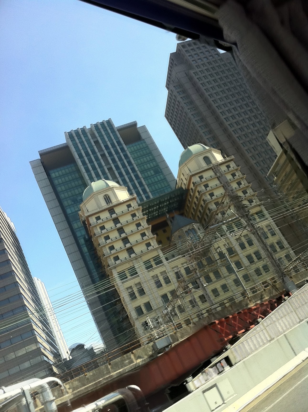
TL;DR: A steep, rolled look up past railway wires at two pale green domes on cream towers, with modern glass behind and a rust orange girder below. It reads as a small-sensor digital frame shot through a moving window in high sun, and the smeared girder says the shutter was slower than the sun alone would need. The one mistake is the grey curtain in the top right, and a step closer to the glass or a crop from the top and right fixes it.
The title is a Chinese proverb, 走馬觀花 / 走马观花 (zǒumǎ guānhuā).
Two domes in a net of wire
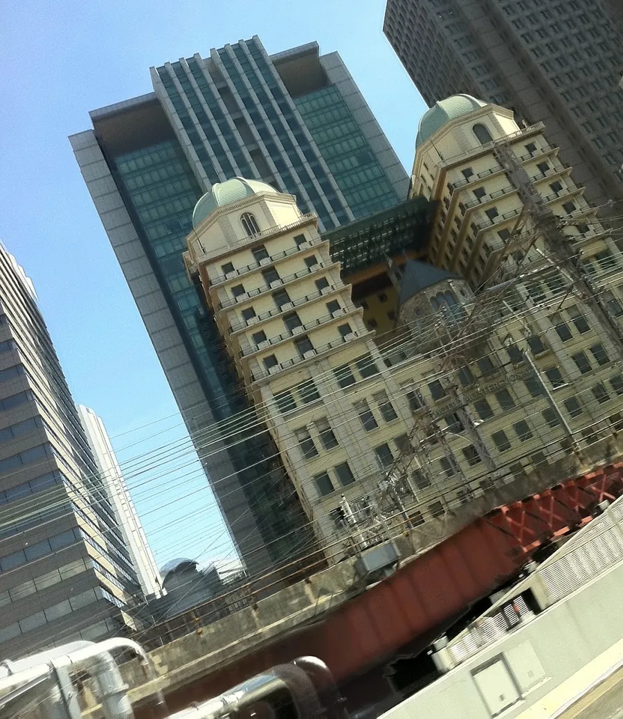
Two domes. They are pale green, the chalky mint that old copper turns, and your eye lands on them before it lands on anything else in the frame. That is strange when you think about it, because they are small. Each one is about a tenth of the picture's width, and between you and them run dozens of black wires, a steel mast, a rust red bridge and a window you are looking through.
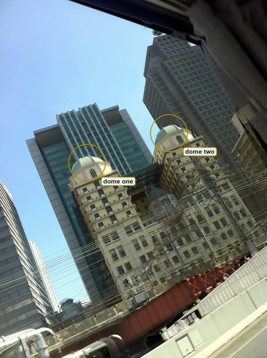
The reason is shape and colour. Everything else in this picture is a rectangle or a line. The domes are the only round things, and their green is the only soft colour that is not sky. The eye is lazy and it goes to the odd one out. So the picture already works before you know what it shows, and only after the domes do you notice that nothing in it stands straight.
A wedding cake in cream
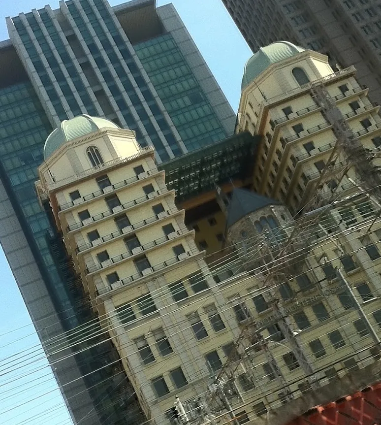
Look closer at what holds the domes up. Each one sits on an eight-sided drum with an arched window, and the drum sits on a tower that steps back floor by floor, with a white railing on every step. It's a wedding cake in cream paint, the kind of tower you know from European cities around 1900, set down here among glass offices.
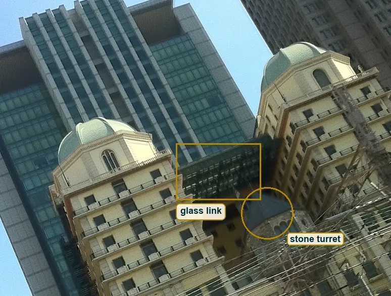
Between the two towers there is more. A small round turret of rough grey stone with a pointed slate roof, like a piece of a castle. Above it a dark glass link joins the towers. Behind everything rises a modern block of teal glass with pale stone fins, and on the right a grey tower with a grid of square windows. So in one crop you get three ages of building, castle, belle époque and office glass, and none of them is from the place they stand in, or all of them are. The picture doesn't tell you, and you don't need it to. What you need is the clash, and the detail gives it.
Six layers deep
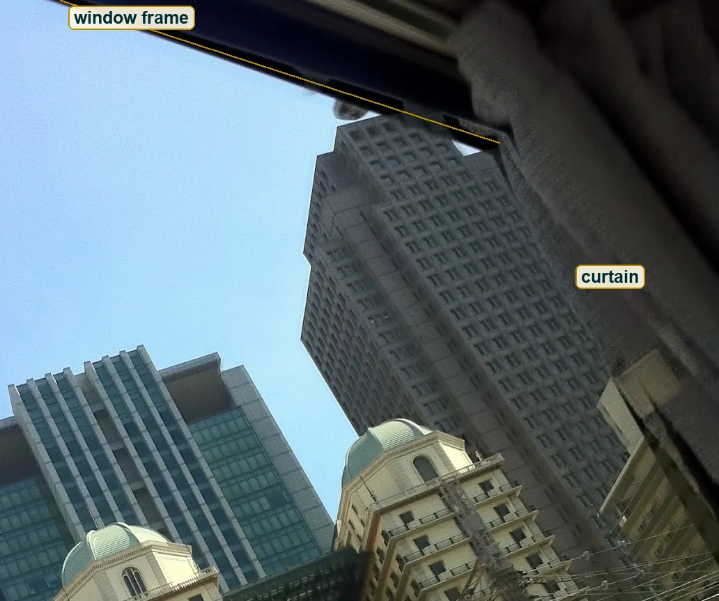
Count the planes in this picture, not the buildings. You get six. Nearest is the grey curtain top right and a dark window frame along the top edge, both just centimetres from the lens. Then soft silver pipes bottom left and a white barrier bottom right. Then the wires and the lattice mast. Then the orange bridge. Then the cream towers with the domes. Then the glass towers and the sky.
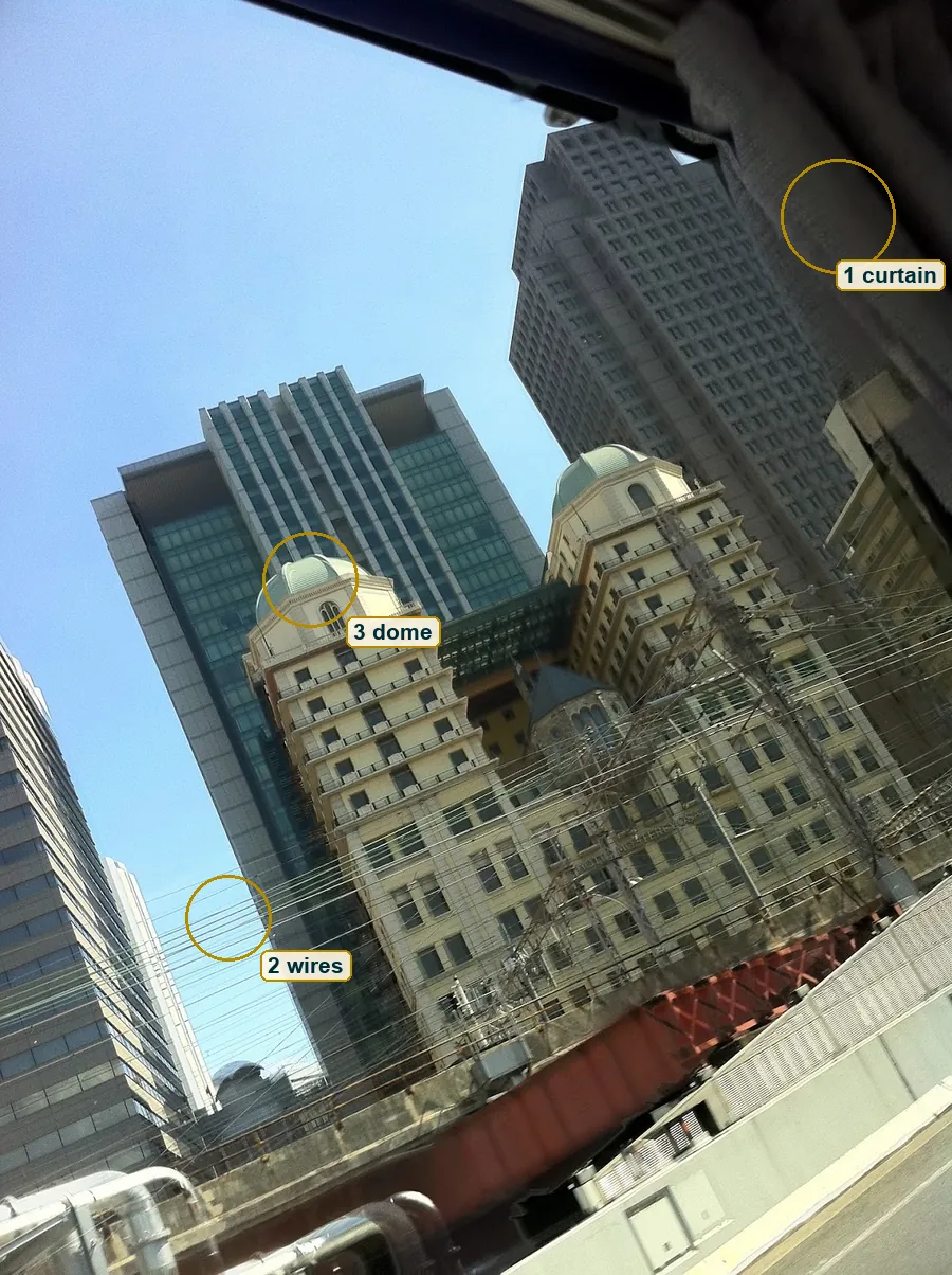
A frame this busy should be a mess, and it nearly is. What saves it is that every layer has its own look. The near layer is blurred, the wire layer is thin and black, the bridge layer is warm, the dome layer is cream and mint, the back layer is cool glass. When each plane has its own texture and colour, the eye can sort them without trying.
Hard light, high sun
The light is plain sun from a sky with no cloud. Look under the balconies on the left tower. Each slab throws a thin, hard shadow straight down onto the wall below it, and the shadows are short. Short and hard means a high sun and no diffusion, so somewhere from late morning to early afternoon.
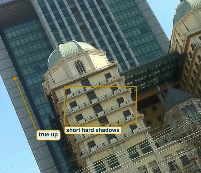
The faces turned toward you are bright and even. Measure both halves of each dome in the file and the left half comes out only a hair brighter than the right, one to two percent. So the sun is behind the camera, maybe a touch to the left, and it hits the domes almost head on. That is why the ribs on the domes look soft. Frontal light kills the shadow side of a curve. If the sun had come from the side, the same ribs would read like the segments of an orange. Hard frontal light is bad news for a face and good news for this kind of building, because every cornice and every railing gets its own black line and the stepped towers look stepped.
A grid knocked over
Now the tilt. The camera points steeply up, so the towers lean in toward a point above the frame, the way a street of tall buildings looks when you crane your neck. And it's also rolled sideways. Trace one wire on the left. In life it hangs level, and in the frame it climbs about 23 degrees from left to right. The bridge and the floor lines of the towers climb with it.
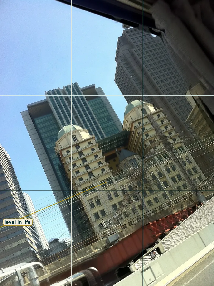
Film people call this a Dutch angle and use it for unease, a world that is off. But look at what the roll does here. The two domes form a rising line, left one low, right one high, and that line runs almost parallel to the wires. The towers cross the wires at near right angles. So the picture is built on a grid, only the grid has been knocked over. The left dome sits on the left thirds line and the right dome near the top right crossing. Rodchenko shot buildings from far below in the 1920s to make you look twice before you know what you see, and he wrote that you should look at a subject from different points of view, "as if one examined it in the round rather than looked through the same key-hole again and again." This frame is one key-hole, but a crooked one. Straighten it in software and you lose a lot. A 3:4 frame rotated back by 23 degrees keeps only about 48 percent of its pixels.
One orange girder
The colours here are quiet. Cream and tan on the towers, mint on the domes, teal on the glass block behind, which rhymes with the domes green on green. Grey for the concrete, the mast and the tall grid tower. And a clean blue sky.
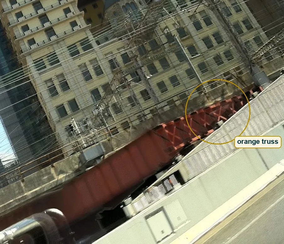
Then one exception. The bridge, and most of all the X-braced truss at its right end, is a deep rust orange. Orange sits opposite blue on the colour wheel, so this one girder pulls against the whole sky. Without it the bottom third would be grey wire and white wall. With it the picture has two poles, mint up top and orange down low, and your eye swings between them across the wires. In a muted street, one strong colour does the work of a spotlight.
What the lens did
No camera data survives in the file, so this is a reading. The view feels moderately wide, near a 28mm equivalent, which on a 3:4 frame gives about 50 degrees across the short side. It is not an ultra wide. Straight edges near the borders stay straight, and the strong lean comes from pointing up, not from the lens bending lines.
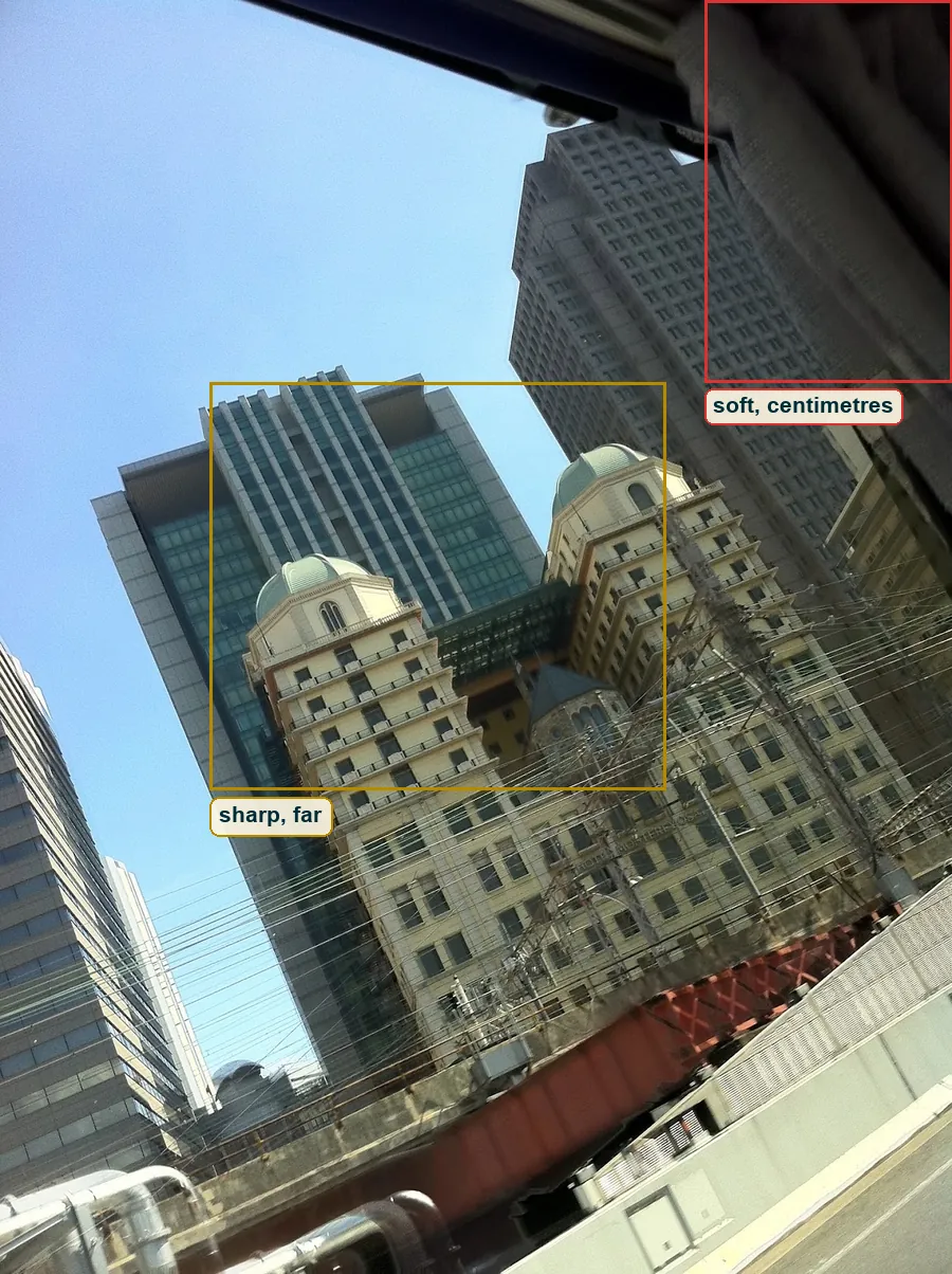
The focus pattern is the big clue. The bridge, the domes and the far towers are all acceptably sharp, and only the things a hand's width from the lens melt. A phone main camera has a real focal length near 6 mm and an aperture near f/1.8. Its hyperfocal distance comes out around 3 to 5 metres, so focus there and everything from about 2 metres to the horizon is sharp. Now put a full-frame camera with a 26mm lens at the same f/1.8 in the same seat. Its hyperfocal distance is about 12 metres. The domes would still be sharp, but the curtain and the window frame would dissolve into a grey fog, almost gone. Same view, same aperture number, and a very different picture of the near layer.
The shutter and the smear
Look at the red girder below the truss. Its vertical ribs are smeared along the length of the bridge, and the truss further right is crisper. That is not focus. Focus blur is soft in every direction. This blur has a direction, the direction of travel. Measure the pixel edges on the girder and the ones across that direction come out about half as strong as the ones along it.
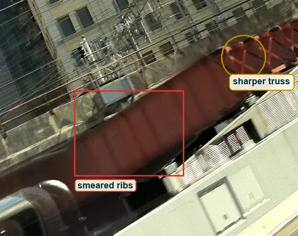
The smear is roughly 30 pixels long. On a frame 1290 pixels and about 50 degrees wide, that is around 1.2 degrees of movement. If the window moved at 30 to 60 km/h and the girder was 3 to 10 metres away, it swept across the view fast enough that 1.2 degrees takes between about 1/40 and 1/270 s. A middle guess is near 1/125 s. Here is the fight. Sunny 16 says that in full sun at ISO 50 and f/1.8 a phone would pick something near 1/4000 s, and tinted glass might take one stop of that. So the smear wants a slower shutter than the sun allows. Either the girder was closer and faster than it looks, or the camera kept a slow shutter for its own reasons. The file can't settle it, and it's better to show you the two numbers than to hide one. Side by side, at 1/2000 s the ribs would be crisp and the picture would lose its one sign of speed. At 1/30 s the wires would double and the domes might start to shake.
Pixels, not grain
Zoom in to 100 percent on the left dome against the glass behind it. The flat glass shows no grain, only soft blotches of slightly different teal. The edge of the dome has a wide, soft light rim. The railing below is mush, the balusters not separated. Colour bleeds past the edges a little.
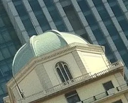
All of that points to digital, a small sensor and heavy processing, and the file has been resized and compressed on top. Film grain clumps and changes size with the tones, and you don't see that here. The sky's noise is tiny, about five levels out of 255. The frame is 3:4, the native shape of most phone sensors, while 35mm film is 3:2. Only about 0.6 percent of the pixels sit near pure white and about 1.2 percent near pure black, most of that black in the window frame, so the exposure held both ends. That is as far as the pixels go. They don't name a camera, and neither does this reading.
Through the glass
Along the top edge runs a dark band, the window frame, so close that it is just a soft wedge of navy. In the top right a grey curtain hangs in, folded fabric that you know only by its shape. A small blurred latch hangs under the frame near the middle. Add the catenary wires at seat height and the white barrier, and the most likely reading is a train window.
Saul Leiter made a whole life's work of this. He shot New York through steamed glass, past awnings and in mirrors, letting soft shapes take half the frame while one small sharp thing carried the meaning. Lee Friedlander did it from the driver's seat in America by Car, with door frames and mirrors cutting the scene. Both made the thing in the way part of the picture. This frame does it less on purpose, but it does it. The window tells you where you sat, and that you were passing.
Are, bure, boke
In 1968 a small Japanese magazine called Provoke made a style famous with three words, are, bure, boke. Rough, blurry, out of focus. It was a push back against the clean photojournalism and the commercial work of its day. Daidō Moriyama shot for Provoke and kept going. For his 1972 book A Hunter he drove across Japan and shot many scenes as he drove past them, and you can see it in the skewed angles and the blur.
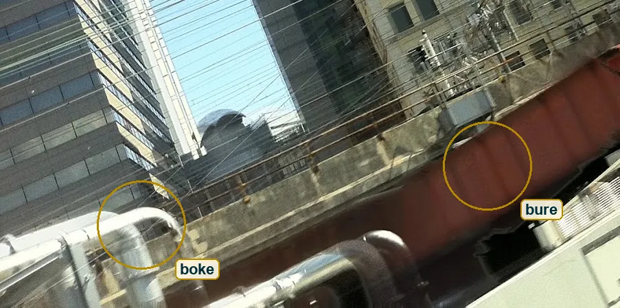
This frame has two of the three words. Bure is the girder smear. Boke is the silver pipes bottom left, round and soft, too close for the lens. Are, the rough grain, is missing, because digital processing smoothed it away. Nothing says the person behind this frame meant any of that. The point is that the Provoke photographers made a style out of what a moving window gives you for free. If you read this as a Japanese city, and the wire density and the masts let you, the link sits close. It's a reading, not a fact about the place.
The one mistake
The tilt is not the mistake. It's strong enough to feel chosen, and the grid holds. The mistake is the curtain. It fills close to a tenth of the frame in the top right, it is grey on grey against the grid tower, and once you know it is a curtain it tells you nothing more.
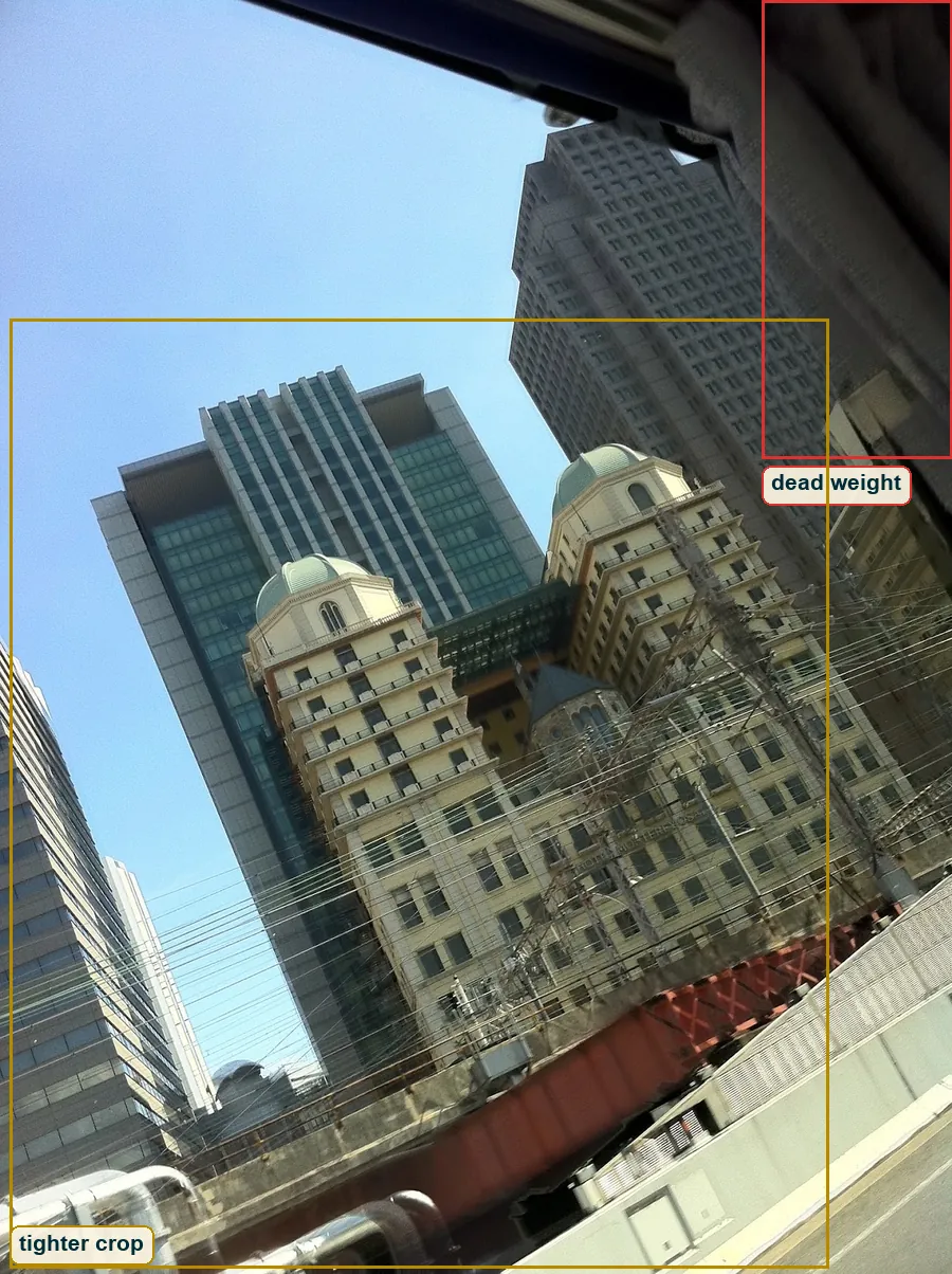
The fix in the seat is simple. Lean in until the lens nearly touches the glass, or push the curtain back with one hand. The fix after the fact is a crop. Cut from the top and the right, keep about the left 87 percent and the bottom three quarters, and you keep both domes, the wires and most of the orange truss while the curtain mostly goes. That is about 65 percent of the pixels, which beats the 48 percent you would keep by straightening. The window frame then stays as a hint, not a weight.
Try this
Take a train or tram line that runs past tall buildings and get a window seat on the side facing them. Wipe the glass, press the phone close to it to kill reflections, and use the main lens, not the wide one. Shoot short bursts as anything strange comes into view, and in each burst look for the one frame where nothing crosses your subject and one colour sits opposite it. Do one ride level and one ride rolled about 30 degrees, then compare which roll looks like a choice.
The journey is home
Back to the two domes. At the start they were the odd round thing in a frame of lines. Now you know what it cost to see them. A seat, a window, a curtain, a girder going by too fast for the shutter, and a few seconds.
Near the start of Narrow Road to the Interior, Bashō writes that every day is a journey, and in Sam Hamill's translation the journey itself is home. Read through that, this is not a picture of a building. It's a picture of passing a building, and the passing is the subject. Most photos of domes like these show them alone, cleaned up and straight, as if the city around them did not exist. This one shows them the way people actually meet them, at an angle, through glass, with the wires in the way. The domes still win the eye. The picture just doesn't pretend it was easy.