Whoever loves the rose bears its thorns
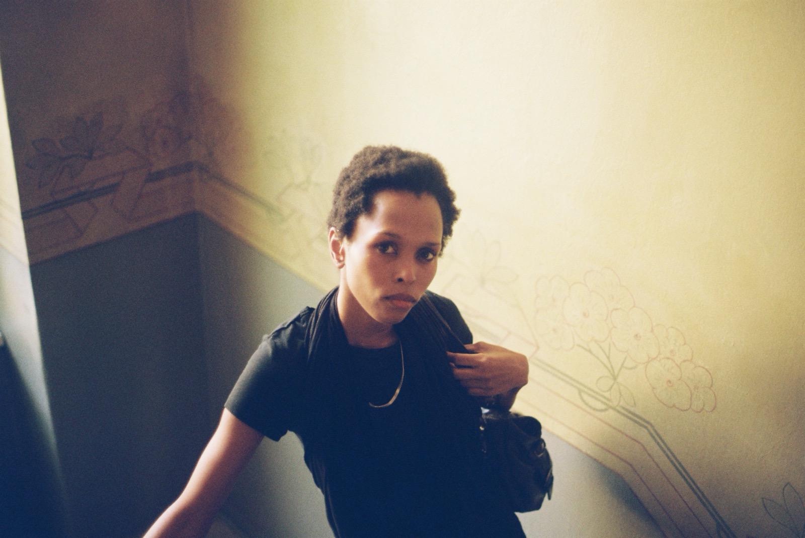
TL;DR: A woman in black looks up the stairs into the lens, and her steady look turns a high camera angle into an even exchange. The far wall falls off with distance and the chain shows hard glints, so a small flash near the lens is the likelier light, about six in ten. A fair reading is a 35mm lens at about one metre, f/4 to f/5.6 on ISO 400 film, but no data exists and every number is a guess with a reason.
The title is a Turkish proverb, Gülü seven dikenine katlanır.
The look comes first
She looks at you before you know where you are. A woman in a black T-shirt and a black scarf stands on a stair below the camera and looks up into the lens. Her mouth is closed and her brows are level. It isn't a smile and it isn't a pose. It's the face of someone who heard her name, turned, and is still deciding how much to give.
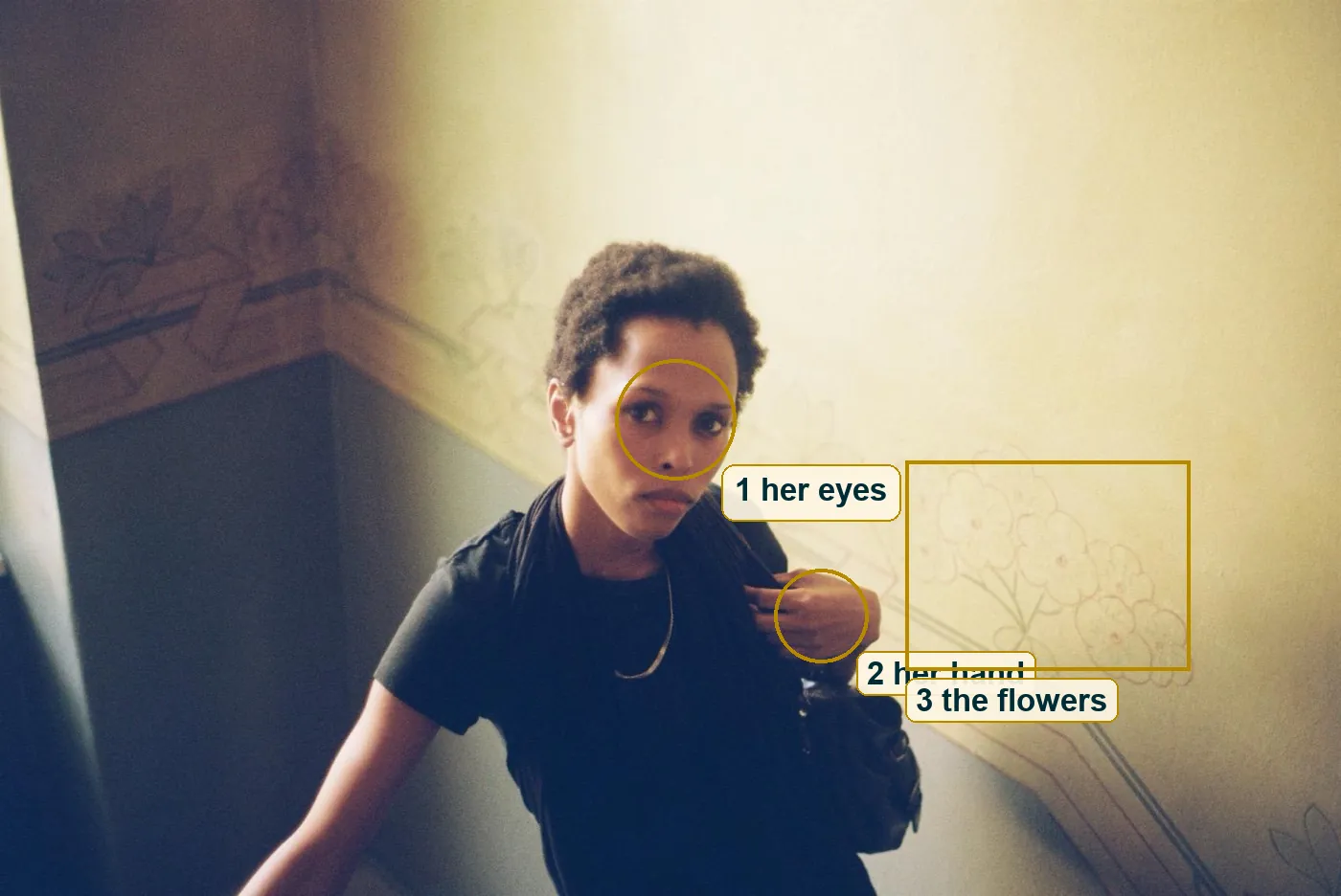
Then your eye moves. First to her left hand, which holds the strap of a leather bag and the edge of the scarf at her collarbone, with a thin chain catching light across the black. Then to the wall, where a faded border of painted flowers runs down at the angle of the stairs. Face, hand, flowers and back to the face, a small loop you go around three or four times before you notice.
We don't know where this is, and the frame doesn't tell us. It reads as the stairwell of an older building, painted long before anyone in the picture stood there.
A painted border, read up close
Up close the border is more careful than it looks. On the right wall there is a spray of small flowers, each with five round petals and a dot in the middle, outlined in a faded rose colour on grey-green stems. Below them two grey lines run side by side, with a thin pink line under those. On the far wall, in shadow, there are bigger pointed flowers, maybe lilies, and ribbon shapes above a dark stripe.
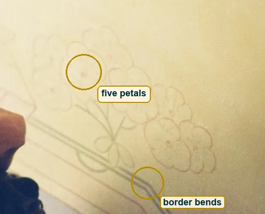
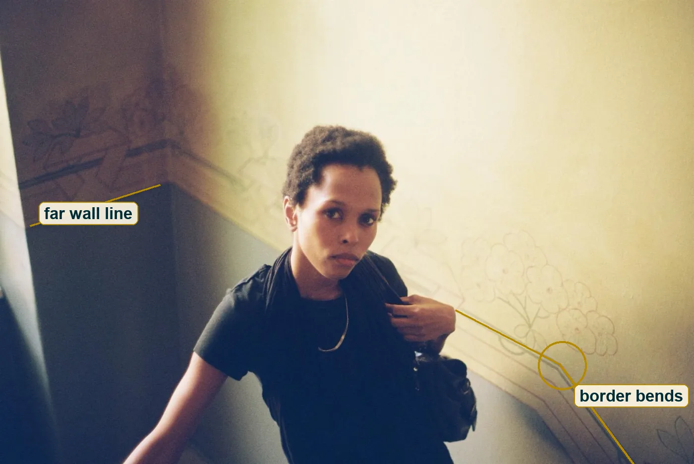
The lines are uneven. Some petals fade out halfway and the width of a stroke changes along one stem. That can be a hand brush or a stencil gone over by hand, and at 1,600 pixels wide you can't tell which. What you can tell is that someone planned the border to follow the stairs. Where the stair turns, the grey lines bend too, from a shallow slope of about 27 degrees in the picture to a steep one of about 53.
A painter decided years ago where every line goes. The photographer decided nothing about the wall and everything about where to stand in front of it. Two kinds of making share one frame.
Three steps above her
The camera is above her, looking down at maybe 20 to 30 degrees. You can read it three ways. Her eyes tilt up to meet the lens. Her head looks a touch big against her shoulders. And the pale wall edge at the far left leans, top to the left and bottom to the right, which is what upright lines do when a camera points down.
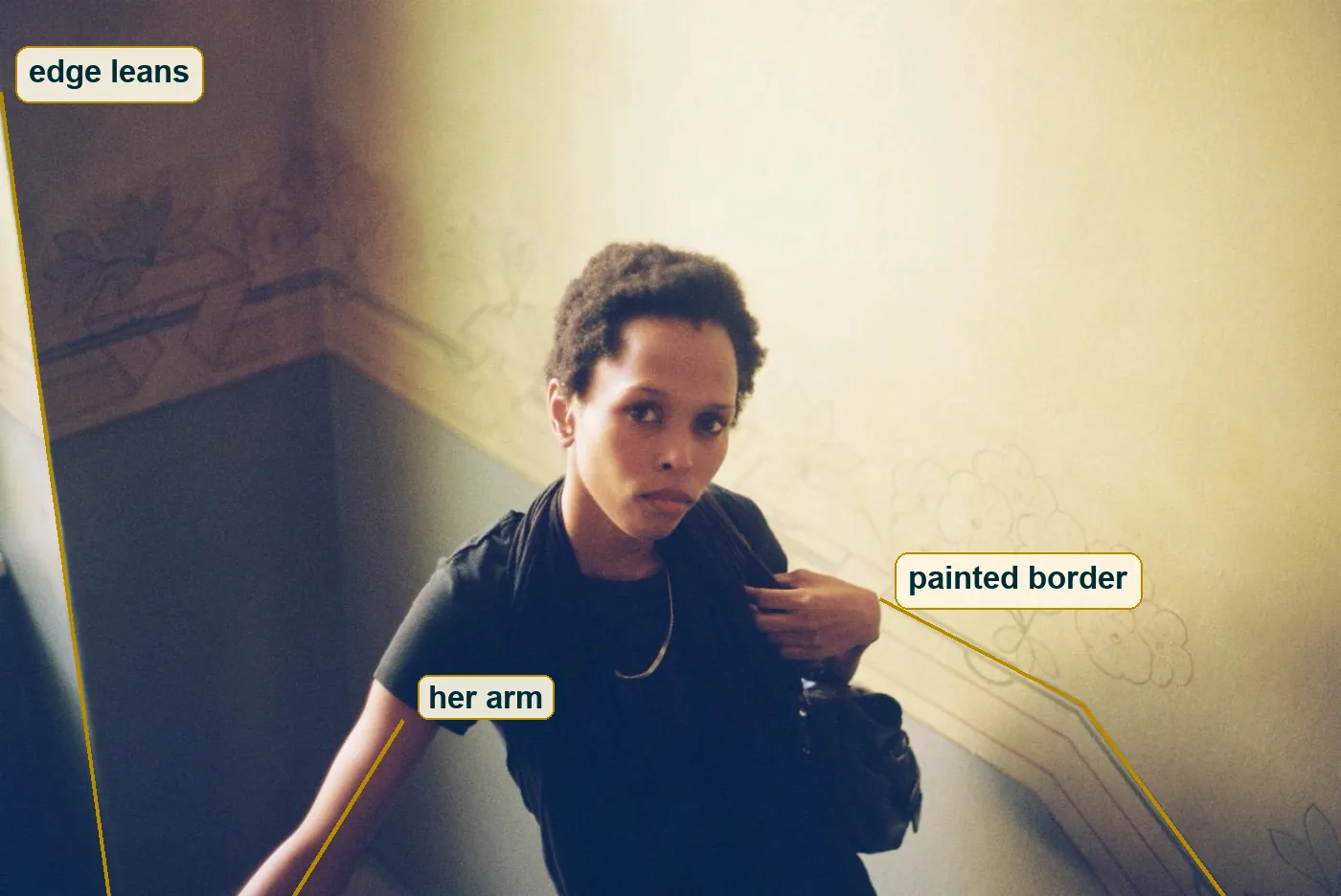
Shooting down on a person is usually called a mistake, because it makes them small. Here it does something else, because she looks back. The high angle asks a question and her face answers it, so the power in the frame ends up even.
The lines hold the frame together. The painted border falls from behind her shoulder to the lower right corner. Her bare right arm falls toward the lower left, reaching for a rail we never see. The two lines open out below her like a tent, and her face sits at the top. The frame is 3:2, the shape of a full 35mm negative, and nothing in it looks cropped.
Why the eyes sit in the middle
Lay a thirds grid over the frame and her eyes miss every line. They sit almost exactly in the middle column and just above the middle of the frame. The rule of thirds would push them up to the top line. The picture is better for ignoring it.
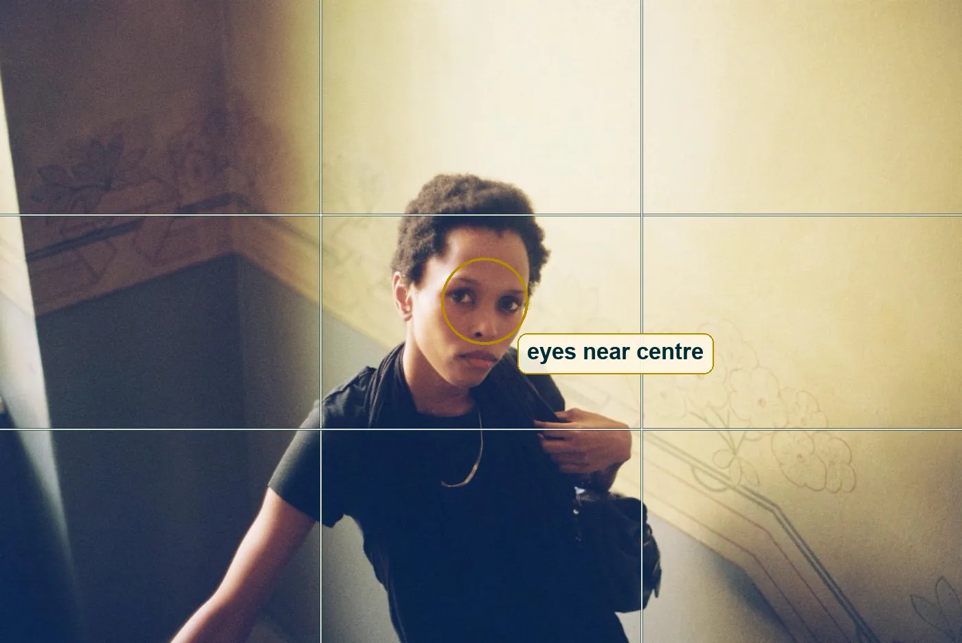
A face on a thirds line becomes part of a scene. A face in the middle looks straight back at you, the way a passport photo or an old icon does, and that is what this portrait wants. The thirds still do some work, just lower down. Her hand at the strap sits close to the lower right point where two lines cross, and the painted flowers fill the cell next to it. So the off-centre interest is there. It belongs to the hand and the wall, not to the face.
The bright wall at the top balances the dark mass of her clothes at the bottom. We come back to it in the mistake section, because it does a little too much.
Window or flash
This is the hardest part to read, and the reasoning is worth more than the answer, because you can use it on your own pictures.
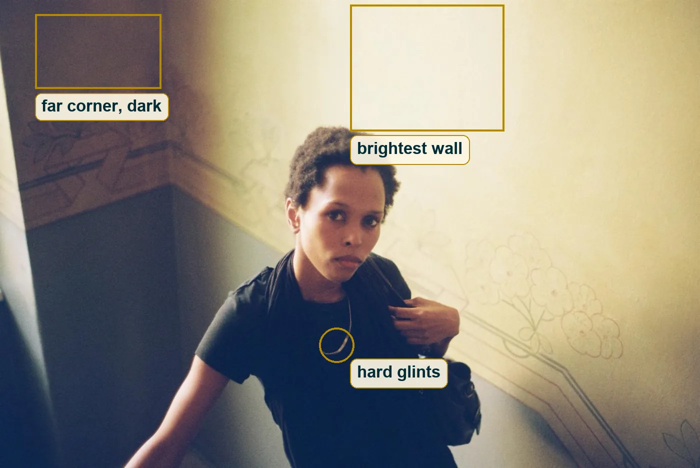
A window and a flash leave different marks. Light from a window falls off with direction. Surfaces that face the window are bright, surfaces that turn away go dark, and how far they are from the camera hardly matters. A small flash on the camera falls off with distance. It follows the inverse-square law, so a wall twice as far away gets a quarter of the light.
Now measure the file. The wall just above her head, the part nearest the lens, is the brightest thing in the frame, about 235 on a scale that ends at 255. The far wall across the landing, at the upper left, is about 78. Her face is lit from the front. There is no hard shadow of her on the wall, which is what you get when the flash sits right next to the lens and her shadow falls straight behind her. And the chain at her neck shows short hard glints, where soft window light would give broader ones.
All of that leans toward a small flash on or near the camera. A window up and to the right could also light that near wall, so call it flash at about six in ten. The catchlights in her eyes would settle it, a dot for a flash and a small square for a window, but at this size they are too small to see.
Black that turns navy
The palette has three notes. Warm cream on the upper walls, a cool slate grey-blue on the lower walls, and the black of her clothes, bag and hair. The faded pink and grey-green of the painted flowers and the gold of the chain are the only accents.
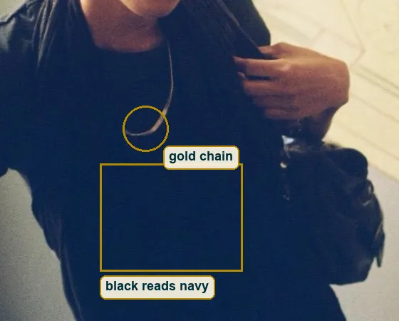
Except the black is not black. Sample her shirt and it comes out at about 10 red, 35 green and 69 blue, a deep navy. The darkest grey value in the whole frame is 21, not zero, and the brightest is 244, not 255. Nothing is clipped at either end. The shadows went blue and stayed open, and the highlights rolled off into cream instead of burning to white.
That is a strong clue about the medium. Colour negative film, scanned by a lab, very often does exactly this. The shadows get a cool cast that nothing in the room had, and the highlights get a warm one. A phone file usually keeps black closer to black. You can fake the look in an edit, so it is a clue and not a proof, but it is the first clue that points to film.
Half a second on the stairs
She doesn't look posed. Her weight seems to be moving, one arm reaches down for support, and the hand on the strap holds it the way people do while walking. Look at what is sharp and what is soft and you can guess the time.
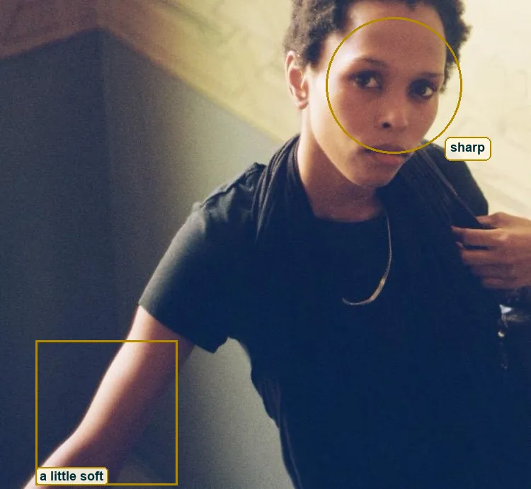
Her face is fairly sharp for a file this size. Her arm at the lower left is a little soft but not smeared. If a flash fired, it lit her for less than 1/1000 of a second, and that short burst froze her no matter what the shutter did. The shutter itself was likely at the camera's flash speed, about 1/60 or 1/125 s, long enough for a little room light to add a soft edge.
Side by side, here is what one other setting would change. At 1/15 s with the flash still on, the room light would print a faint second copy of her arm next to the sharp one, a ghost of the step she was taking. With no flash at 1/60 s, her face would stay sharp only if she held still, and the moving arm would stretch into a streak. The frame we have sits between the two, sharp where it counts and a little loose at the edge.
Horace wrote "Dum loquimur, fugerit invida Aetas", time fleeing while we speak. Here the shutter takes only a very short slice of a turn on the stairs, and you can still feel the turn in it.
How far away the camera was
No camera data exists for this file, so every number here is a reading with its reason. Start with her head. From the top of her hair to her chin, it fills about a third of the frame height.
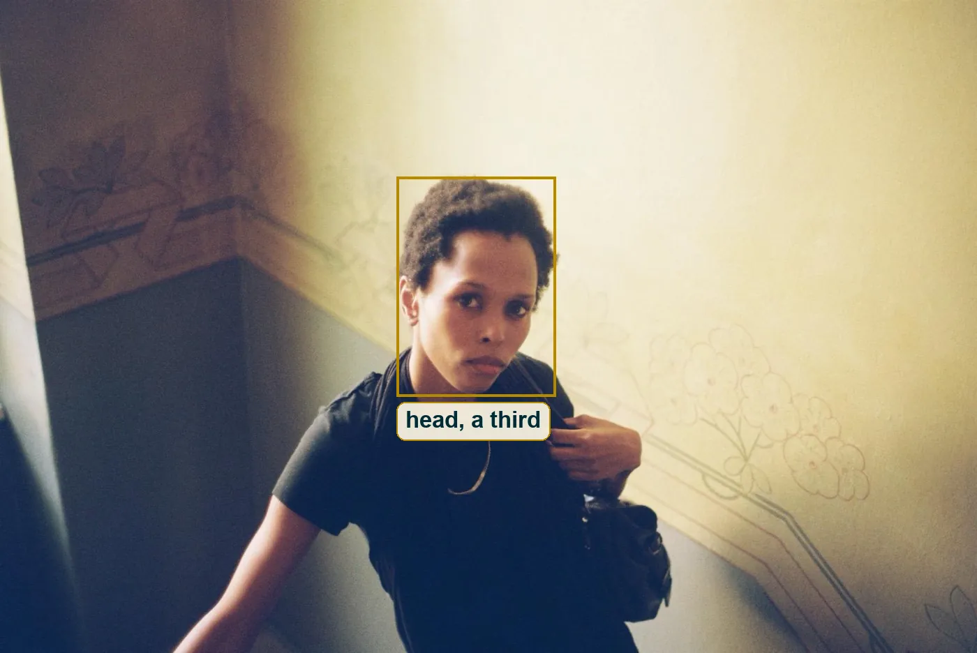
A head like that is about 23 centimetres. If it fills a third, the frame covers about 70 to 75 centimetres top to bottom at her distance. A 35mm film frame is 24 millimetres tall, so with a 35mm lens the camera sits about one metre from her face. With a 28mm it would be about 85 centimetres, and with a 40mm about 1.2 metres. Nothing bends at the edges the way a 24mm bends things up close, so something around 35mm fits best, the standard lens on a lot of compact film cameras.
Now the depth. At one metre with a 35mm lens at f/5.6, the sharp zone runs from about 0.88 to 1.16 metres. Her face sits in it. The wall behind her is a little further away, just outside, and that is why the painted flowers read clearly but softly. Open up to f/2 and the sharp zone shrinks to about 0.95 to 1.05 metres. The flowers would melt into pink smudges and the wall would stop being a second subject. Stop down to f/11 and the flowers would be as crisp as her eyes and start to argue with her. f/4 to f/5.6 lets the wall talk without shouting.
ISO 400 film, f/4 to f/5.6 and about 1/60 s with a small flash fits the grain, the depth and the sharpness. None of it is recorded.
Film or a filter
The file name says film. Worth testing instead of believing.
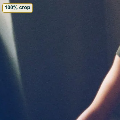
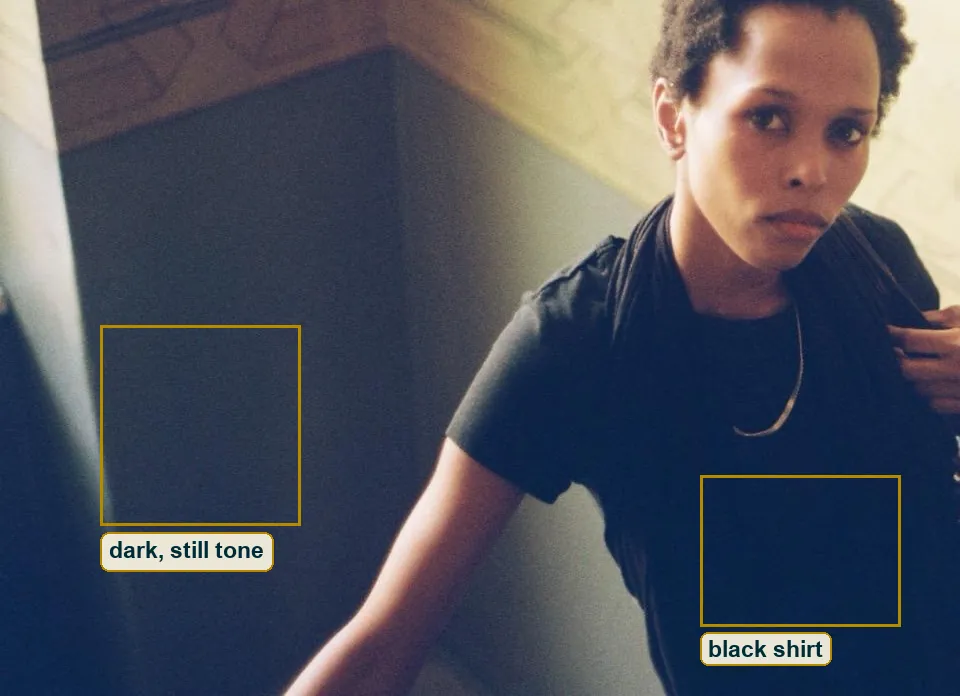
Measure the fine texture in three flat patches. On the bright wall above her it is very low. On her black shirt it is about one and a half times as strong. In the blue shadow of the lower wall at the left it is about three times as strong. Colour negative grain behaves like that, quiet in the bright parts and loud in thin shadows. The open, coloured shadows and soft highlights from the last sections point the same way.
The other side deserves a fair hearing. At 1,600 pixels wide, real grain and good fake grain look much alike. Up close the texture is fine and even rather than clumpy, and a digital file with a film look can come out like that too. There are no frame edges, no dust and no scratches. And 3:2 is the native shape of most digital cameras as well. On balance film is the likelier answer, maybe six in ten, and a bigger scan would decide it in a second.
DeCarava and the dark hallway
The photographer this frame sits closest to is Roy DeCarava. In 1953, during a Guggenheim Fellowship, the first one awarded to an African American photographer, he made a picture called Hallway. A dim bulb at the end of a narrow corridor, and very little light.
DeCarava printed soft and kept his pictures low on the tonal scale. He let dark stay dark and still made you see into it. Asked which single picture he would keep, he picked Hallway, and told a San Francisco journalist it was all the hallways he grew up in.
This colour frame borrows some of that patience with darkness. The lower left is deep navy, but you can still see the wall in it. Her shirt holds a shape and the bag holds a sheen. Nobody pushed the shadows up to make the picture easy. And like Hallway, the stairwell is more than a backdrop. It is a space you feel you have stood in yourself.
Hughes and the crystal stair
In 1955 DeCarava made a book with a writer. The Sweet Flypaper of Life puts his photographs of family life in Harlem next to a story by Langston Hughes. Hughes had written about a stair more than thirty years before, in the 1922 poem Mother to Son.
In it a mother tells her son, "Life for me ain’t been no crystal stair." Her stair has tacks and splinters and boards torn up, and still she keeps climbing, reaching landings and turning corners. The poem is about going on, not about arriving.
You don't need to know anything about the woman to feel why the poem fits. In the poem a stair is a life. In this photograph a stair is a real place of plaster and slate paint, with a painted border that runs along the far wall at the landing and bends where the flight turns. She stands close to that turn. The picture catches someone between landings, and that is where the poem lives too.
The one mistake
The brightest thing in a portrait should usually be the face. Here it is the empty wall just above her head.
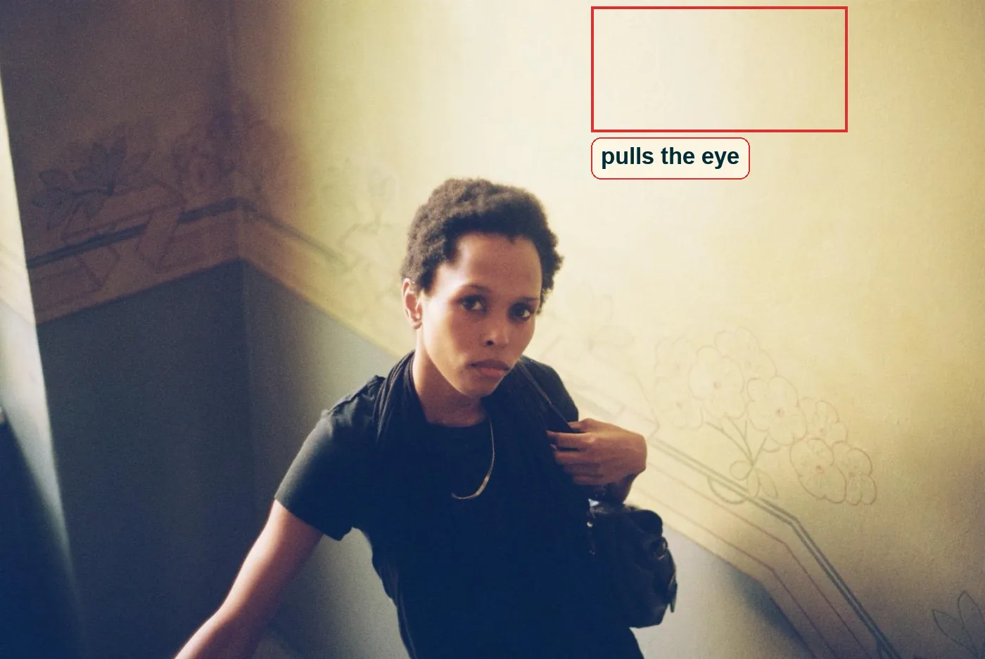
Your eye goes to bright areas first, and that patch of cream is the brightest and biggest plain area in the frame, right next to her hair. Every time you go around the loop of face, hand and flowers, it pulls you up and off the picture.
The fix is small. Darken that corner by half a stop to a stop in the print or the edit, so the wall stays light but sits below her forehead. Or trim a few percent off the top. Don't crop tight to a 4:5 portrait, because then the border stops being a line through the frame and the feeling of looking down a real stairwell goes with it.
Try this
Find a stairwell with one light, stand three or four steps above a friend, ask them to keep walking up, say their name and shoot when they look up, ten times.
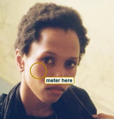
Meter on their lit cheek and not on the wall, and with dark skin or dark clothes take off a third to two thirds of a stop so the face stays rich. Then shoot the same spot once with flash and once without. Compare the far wall in both frames and you will see for yourself which light falls off with distance.
Back to the look
Go back to her eyes. Now you know more about everything around them. A flash, probably, fired from about a metre away and three steps up. A border painted by someone long gone, its lines bent to follow a stair. A black shirt that probably turned navy in a scanner.
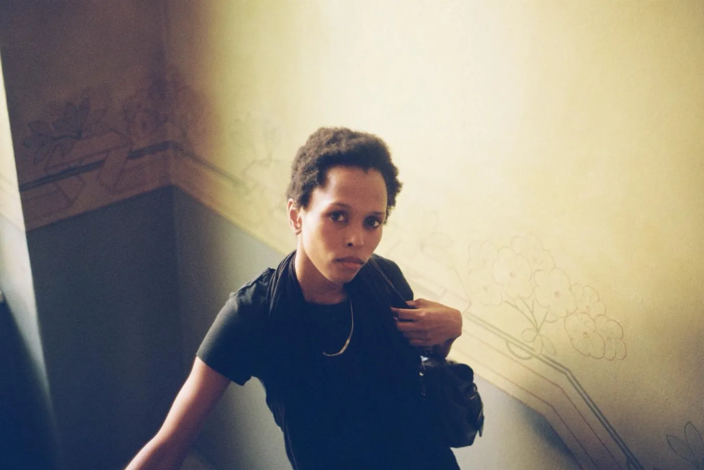
And still her face gives nothing more away. The camera stood above her and ended up being the one that was looked at. The flowers soften her and she sharpens the flowers, and neither one wins. This picture tells you a lot about its light and its lens, and almost nothing about her, which is the right way round for a portrait.